Designing Memorable Experiences in Audio News at Noa
In this project, we transformed Noa into an immersive audio news platform, improving user engagement and retention. Our redesign resulted in a 12% increase in active listeners.
Background
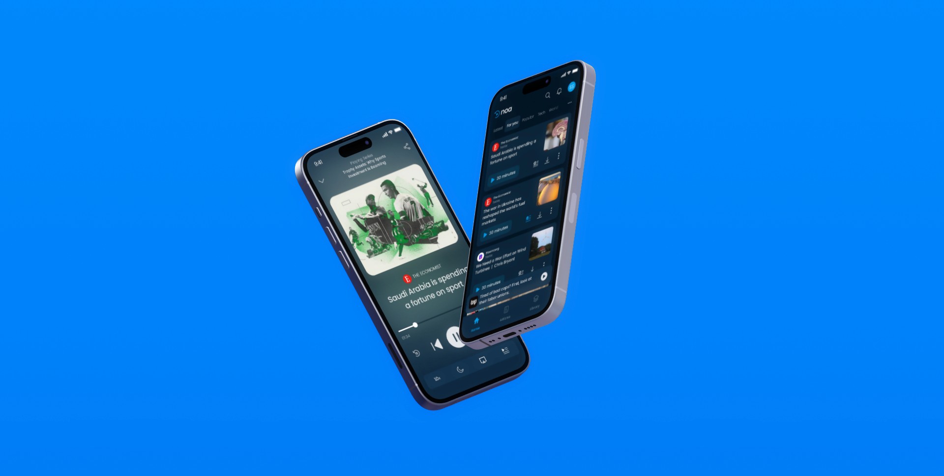
Noa offers listeners a seamless way to engage with premium journalism, streamline their news consumption, ensure a high-quality listening experience, and stay effectively informed on key topics through curated audio Series.
Problem Statement
Noa faced challenges with user retention and content discoverability. The existing app lacked an intuitive design, leading to a high churn rate.
Objectives
Simplify the user interface and improve navigation.
Enhance content discoverability and personalization.
Create a consistent and accessible visual design.
Process and Approach
Research
Conducted 50+ user interviews, surveys, and usability tests to gather insights into user behavior and preferences. These users ranged from power users to dropped off users to have an understanding of the entire spectrum of users. These were then condensed into user personas to have a on-hand guide to user thinking.
User flow and empathy
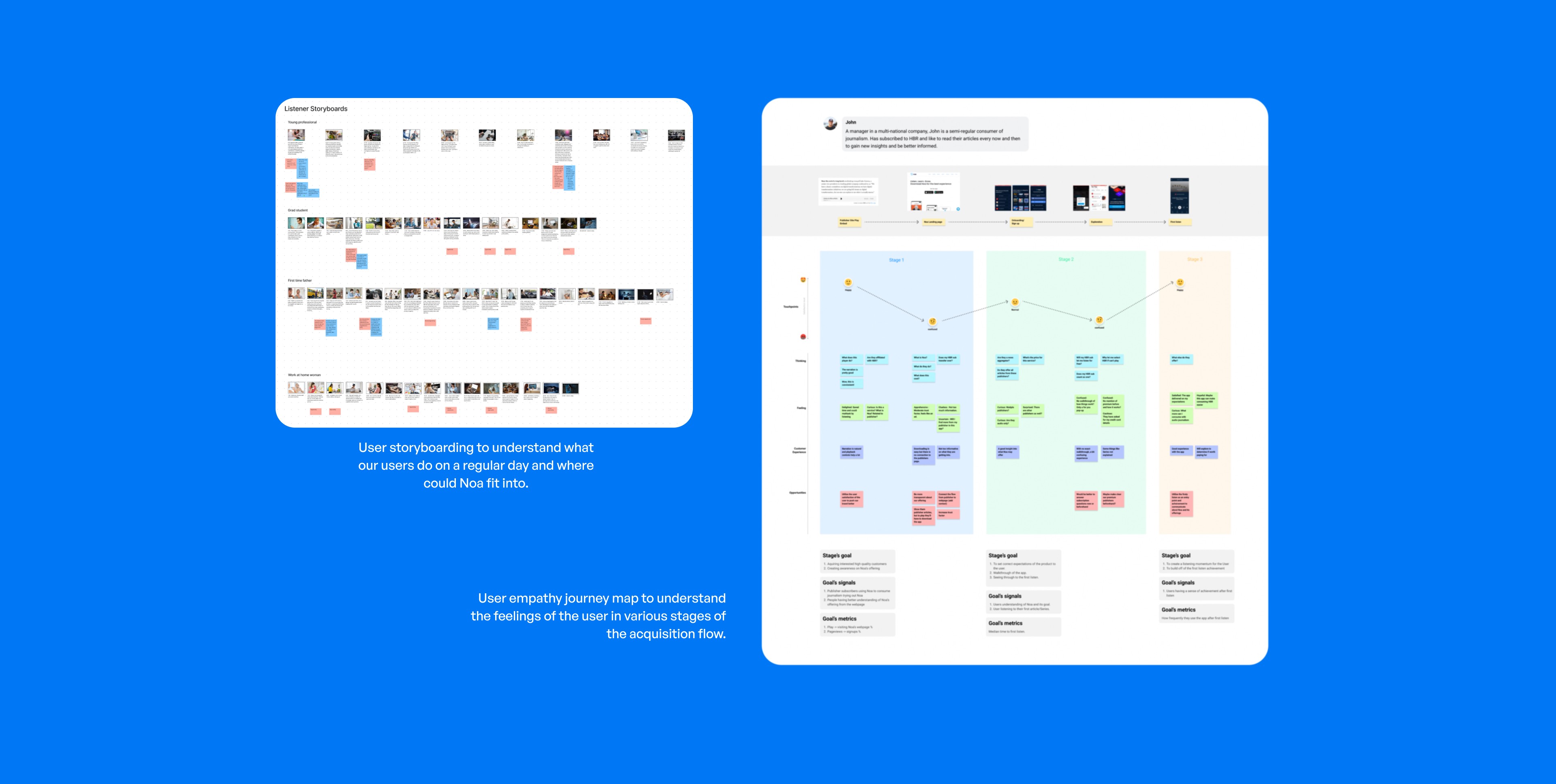
We adopted a design thinking methodology to deeply understand and connect with our users’ experiences. By defining key issues and brainstorming innovative solutions, we developed user flows and empathy maps to gain insights into the existing user journey and identify critical pain points. Leveraging the qualitative data gathered, we designed an optimized user journey, ensuring a seamless and intuitive experience for our users
Wireframing and High fidelity designs
To effectively conceptualize the solution, we crafted low-fidelity wireframes that facilitated rapid visualization. This approach enabled swift ideation sessions with the team, where we could sift through a broad spectrum of potential solutions, ensuring a comprehensive exploration of viable options. Following a thorough selection process, standout concepts were marked for validation and subsequently transformed into high-fidelity prototypes, ready for more rigorous testing and refinement.

Prototyping and User Testing
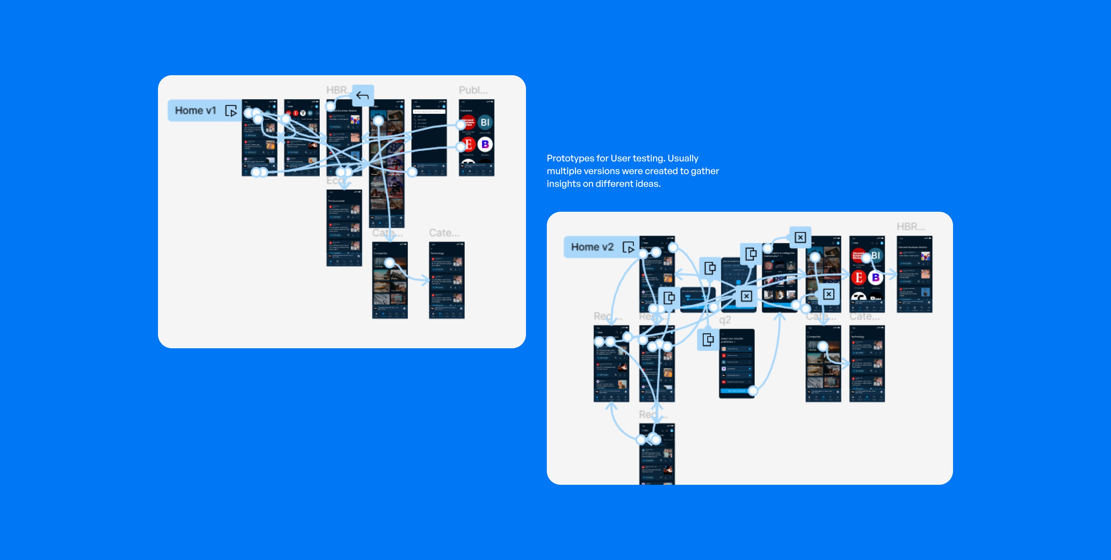
I meticulously designed high-fidelity designs with a keen focus on the user flow and critical screens targeted for evaluation. We conducted extensive user testing, employing these interactive prototypes to capture real-time feedback and facilitate iterative enhancements. Utilizing Figma for prototype interactions and Zoom for direct observation, we conducted over 40 user testing sessions, each providing a wealth of insights.
UI Design
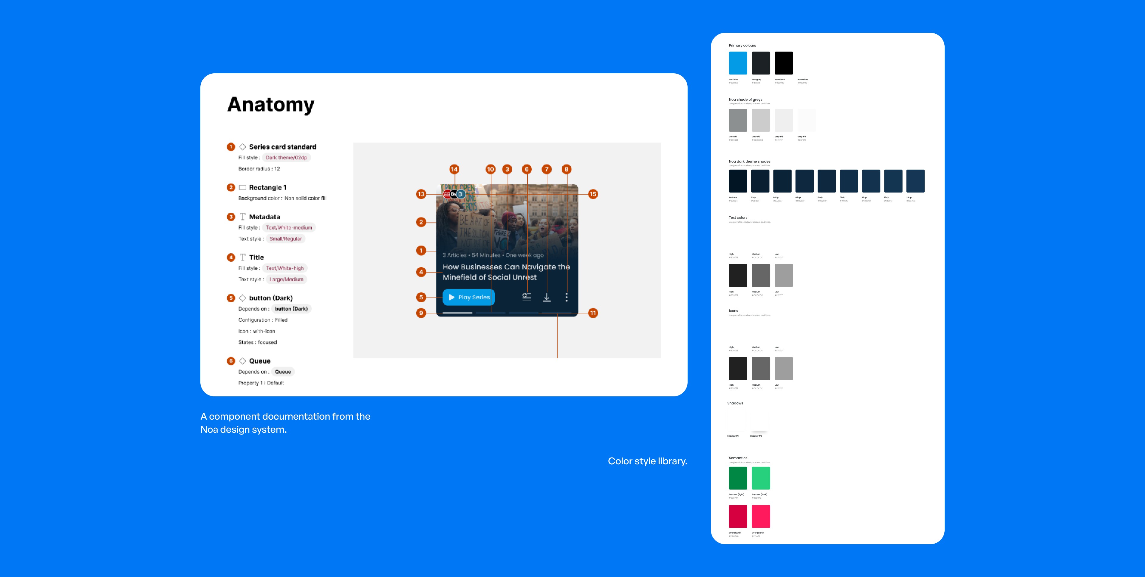
After a rigorous selection process, we usually finalized a design that resonated with our users and implemented the necessary modifications informed by their feedback. Concurrently, strategic business decisions were made to ensure alignment with our core priorities. We upheld a comprehensive design system to guarantee consistency across all interfaces. Newly identified components were seamlessly integrated and meticulously documented. Our commitment to a sleek, modern aesthetic was reflected in our use of uniform typography, color palettes, and inclusive design principles. The result was a robust design system, featuring over 120 components, all harmonized to create a visually cohesive and user-friendly experience.
Problems Identified and Solutions
Navigation Issues
Users struggled to find desired content and categories like their favourite publisher and category, leading to frustration and limited exploration of Noa’s offerings.
Solution
We pinpointed the key goals and screens that users frequently sought during their sessions. It became evident that ‘Publishers’, ‘Categories’, and ‘Queue’ were the focal points, yet they were not readily accessible via the existing navigation interface. To address this, I redefined the navigation’s scope to seamlessly include these essential destinations, while preserving a default home page for users seeking personalized recommendations. This strategic redesign placed all vital screens just one tap away, significantly enhancing user accessibility.

Irrelevant Content Recommendations
Users were dropping off due to irrelevant content during initial sessions.
Solution
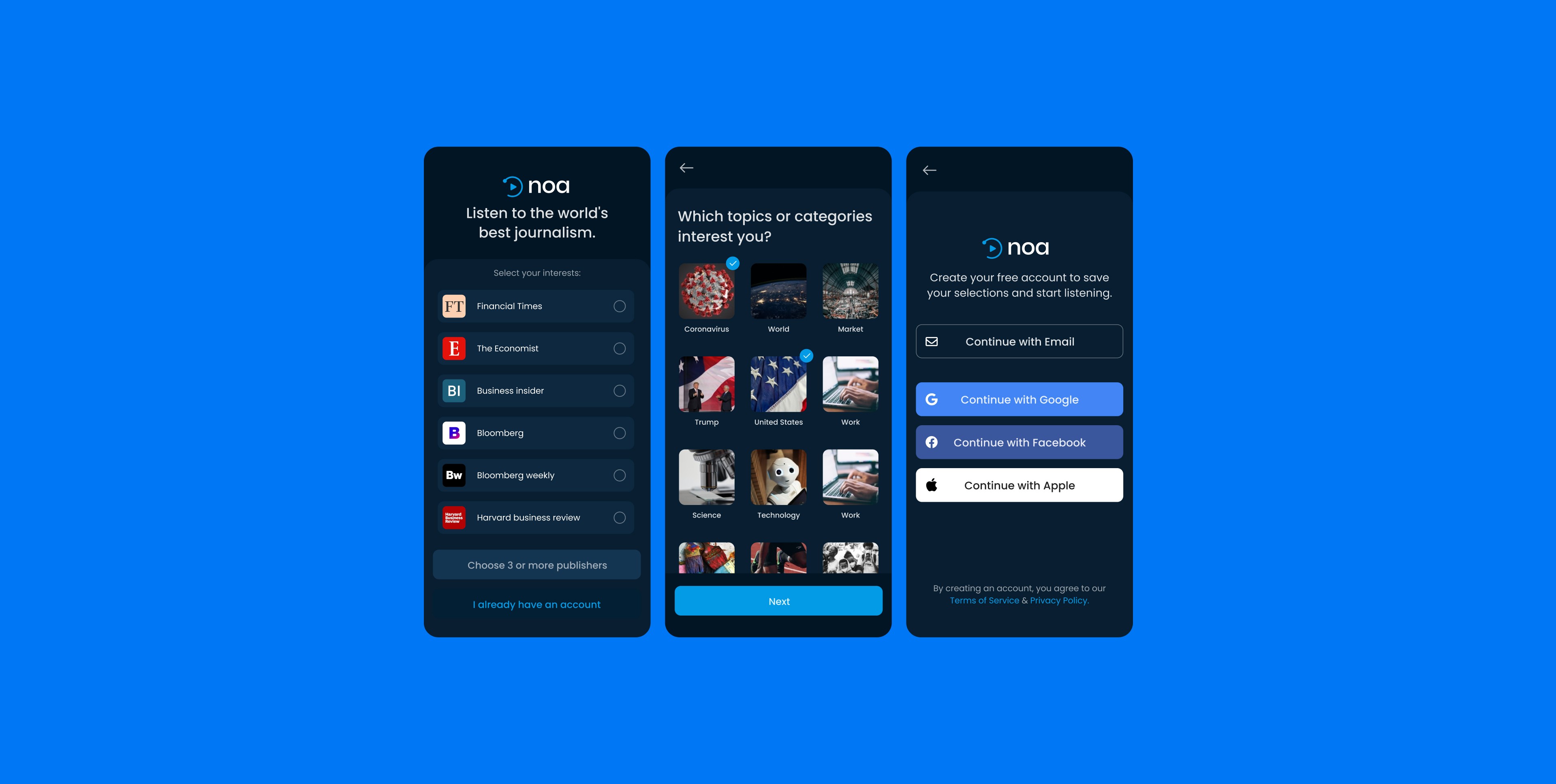
We introduced a setup-centric onboarding process designed to capture users’ preferences, including their top three publishers and five favorite categories and sub-categories. This enabled us to curate personalized content recommendations right from the outset, ensuring a swift and engaging first listening experience that boosted retention rates. This strategic move not only improved the caliber of users entering the signup funnel but also acquainted them with Noa’s range of publishers and the breadth of categories available for exploration, thus providing a twofold advantage.
Limited Home Page Control
Users wanted more control over their content discovery experience.
Solution
We transformed the home screen from a single-page layout to a tab-based interface, aligning with user preferences for frequent exploration of favorite categories. To serve our users’ desire to stay informed, we introduced a ‘Latest’ tab, strategically positioned for easy access to the newest articles. We empowered users with customizable tabs, enhancing their control over the app’s navigation. The ‘For You’ tab remained a staple, powered by a robust recommendation algorithm to guide those seeking suggestions.
Additionally, we integrated filters to allow users to swiftly tailor their content, such as selecting articles of a specific duration based on their use case or excluding older content, thereby streamlining their experience to match individual needs.

Results
Achieved a 12% increase in active listeners and a significant reduction in churn rates. Positive user feedback highlighted improved discoverability, ease of navigation, and the sleek UI. A rating of 4.7 stars on the App Store.
Learnings
The importance of user-centered design and iterative testing in creating a product that meets user needs and expectations.
Personal Touch
In my spare time, I explore new audio technologies and experiment with different design approaches. My passion for creating user-friendly audio experiences drives my continuous learning and improvement in this field.
Summary
Adopted a user-centric design approach for problem-solving at Noa.
Conducted in-depth user interviews to inform feature design.
Utilized user flows, empathy maps, and wireframes for clear stakeholder communication.
Performed extensive user testing to refine and finalize design solutions.
Maintained a comprehensive design system to streamline design and development.
Enhanced navigation for better discoverability of key pages.
Revamped onboarding for a personalized first listening experience.
Redesigned home page for increased customization and content management.